Claude Skills for UI/UX: How to Build a Website That Doesn't Look Like AI Slop
What happened when I tested a Claude UI skill against a dedicated UX and accessibility audit — and what each one actually caught.
A few weeks ago I hit a familiar wall. I kept noticing that a lot of AI-generated websites look the same — generic hero sections, the same gradient, the same "AI startup" energy. Honestly, some of my own early builds were guilty of it too.
I'd been experimenting with a deterministic approach to UI generation: instead of letting a model freely design a page, constrain it with fixed design profiles, closed vocabularies, and rules-based rendering. The theory was simple — freeform generation is inconsistent, so remove the freedom and you remove the inconsistency.
Then I tried something that made me question my own thesis.
Part 1: The Claude skill that stops your website from looking like AI slop
I installed Anthropic's frontend-design skill — one of the official skills published in the anthropics/skills repository, and discoverable through The Agent Skills Directory — and paired it with Opus 4.8 to build a landing page and a small multi-screen product from a single brief.
The result surprised me. Not "pretty good for AI" — genuinely premium. Distinctive serif typography instead of the usual system font default. A warm, considered color palette instead of the typical purple-on-white template. Real narrative copy in the hero section, not generic feature bullets. A working, animated review carousel. Consistent visual language carried across a landing page, a dashboard, a settings screen, and a trainer directory — five different screens, one coherent design system.
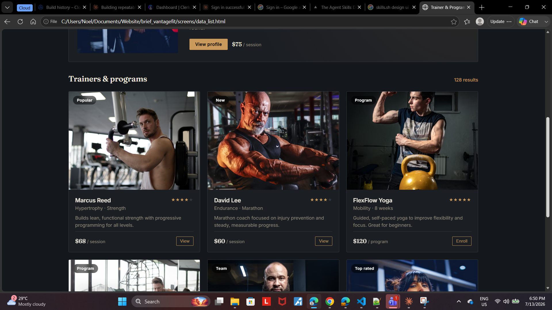
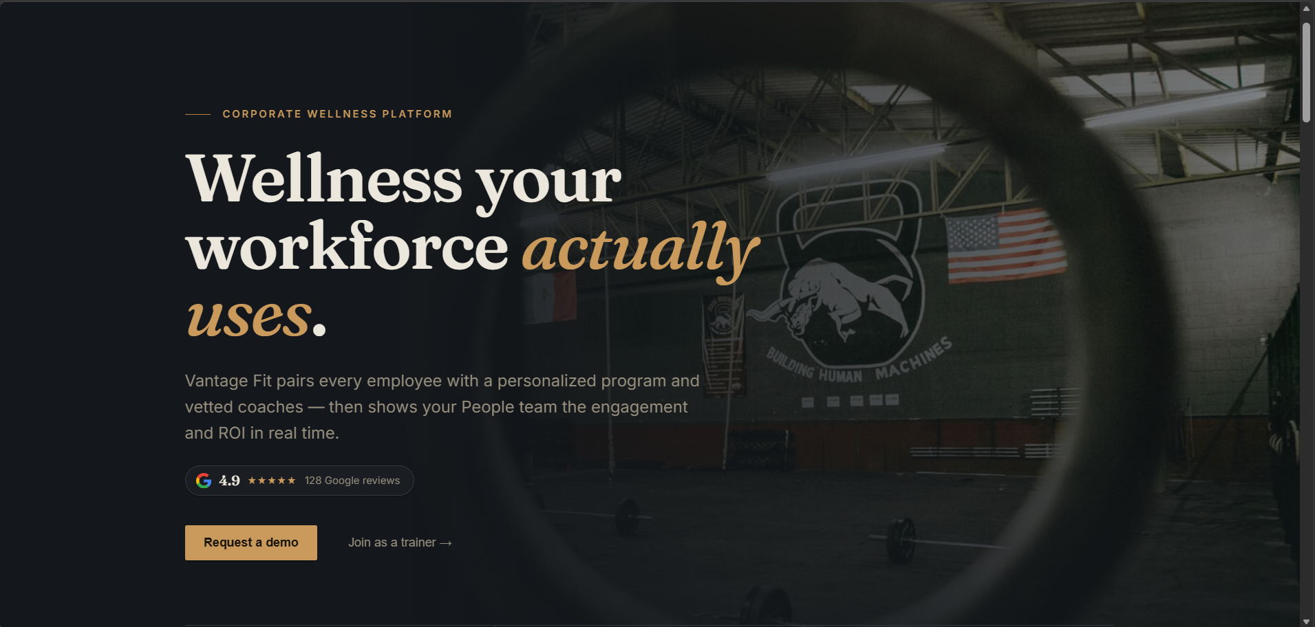
What makes the skill work isn't magic — it's structure. Before generating anything, it walks through four questions: who is this for, what tone fits, what are the real constraints, and what would make this interface memorable. It also actively avoids the visual tells of "AI slop": no default Inter/Roboto pairing, no purple gradient on white, no predictable card grid. It pushes toward a specific, committed aesthetic direction instead of a safe average of every direction at once.
You can feed it real brand assets — logos, images, guidelines — to make the output feel bespoke, or let it establish a creative direction on its own from just a brief description of the business.
One detail that mattered more than I expected: I had it integrated with the Pexels API, so instead of generic placeholder blocks or obviously-stock-looking imagery, it was pulling real, contextually relevant photography — actual gym equipment, actual people mid-workout — matched to what the page was actually about. That's a small thing, but it's a big part of why the result felt like a real product screenshot instead of a mockup. A premium-looking layout with placeholder gray boxes still reads as unfinished; swap in the right real photo and the same layout suddenly feels shipped.
What it doesn't do
To be clear about the boundary: this is a visual and copy-voice skill. It does not handle:
- The specific business logic your product actually needs
- Secure payment portals, authentication, or session handling — these should come from established, audited libraries (Stripe Elements, Clerk, etc.), not generated freehand
- Hosting and backend architecture
None of that is a criticism — it's simply outside the skill's scope, and it's honest about that scope in its own documentation.
Part 2: UI vs UX — why a good-looking site still isn't enough
A polished landing page is only half the job. Once someone is actually using a product — filling in a form, navigating with a keyboard, hitting an error — a different set of decisions takes over. That's UX and interaction design, not visual design, and it's a distinct discipline with its own body of practice.
So I installed a second skill, bencium-controlled-ux-designer, and ran a real audit against the same prototype.
Two things stood out before I'd even generated anything.
It asks before it acts. Its first rule isn't a design rule — it's a process rule: always present two or three options with tradeoffs and wait for approval before implementing anything. frontend-design just builds. This one interviews you first. That's a meaningfully different working style, and worth knowing before you invoke it expecting instant output.
It disagrees with frontend-design on aesthetics. Its defaults call for flat surfaces — no drop shadows, no gradients used for depth. The site I'd just built leaned on soft shadows and gradient overlays throughout. Two reputable, well-built skills, two different opinions on what "good design" even means. I'd expected these tools to converge on some obvious best practice. They didn't. Taste is still a choice, even when a model is making it.
The audit: what a visual-design tool structurally cannot catch
Here's what the UX-focused audit found on a site that, by every visual measure, looked finished:
- No visible keyboard focus anywhere. Tab through the site and you had no way to tell where you were. This fails WCAG 2.4.7, and it affected every single screen.
- The logo wasn't actually a link. It was a
<span>with an onclick handler — visually indistinguishable from a real link, but completely unreachable by keyboard and invisible to screen readers. - Seven form labels in the settings page weren't programmatically associated with their inputs. Visually, every field had a label sitting next to it. Structurally, a screen reader would announce every one of them as "edit text, blank."
- The settings sub-navigation was dead. Profile, Notifications, Billing, Security — four tabs that looked completely interactive and did absolutely nothing. No
href, no handler, not keyboard-operable.
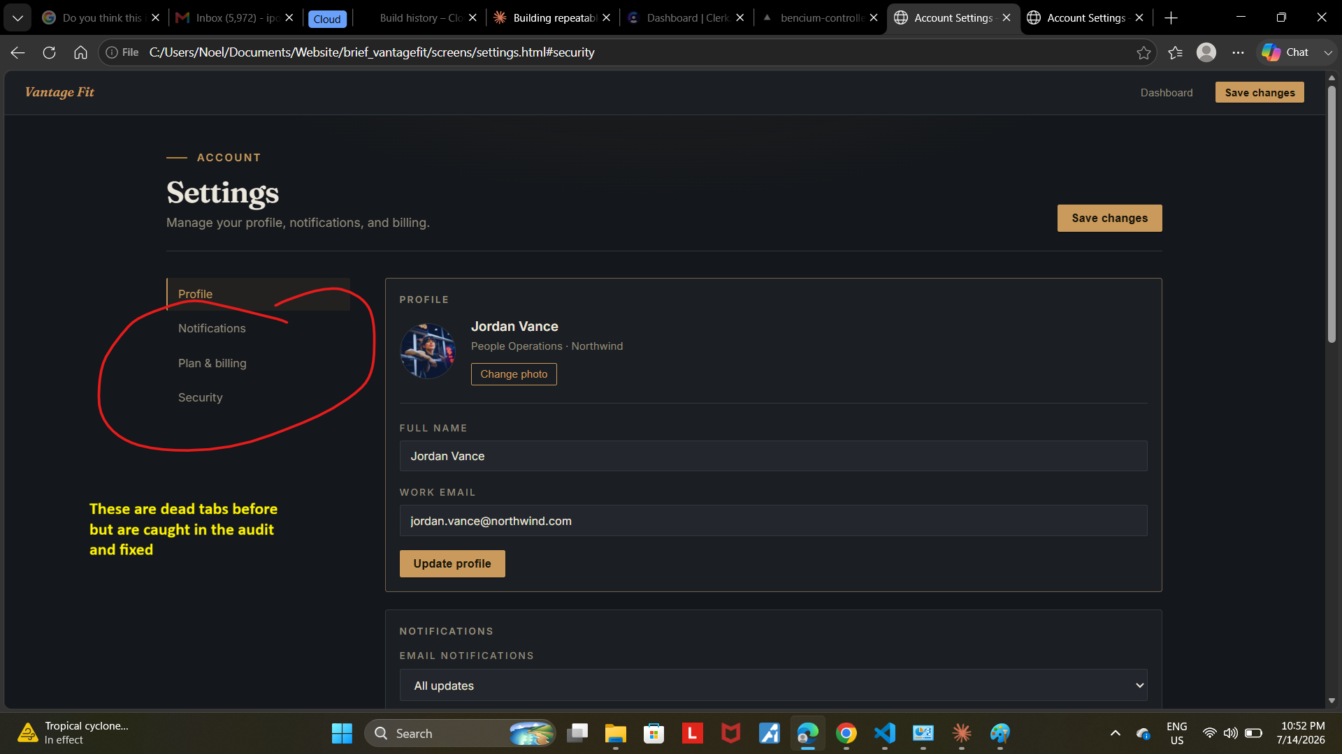
None of these are things AI discovered that a human couldn't have found. Any UX practitioner tabbing through the site for five minutes would have caught every one of them. What the audit actually did was compress that manual pass — checking every screen, every input, every interactive element systematically — into one structured report instead of an hour of clicking around by hand.
That's the actual value: not replacing judgment, but speeding up the testing that judgment still has to do.
What got fixed
All four high-priority issues were resolved and independently verified, not just claimed:
- A visible, authored focus ring now appears on every interactive element across all five screens
- The logo is a real, keyboard-focusable anchor tag
- All seven settings inputs now have properly associated labels — confirmed programmatically, not just visually
- The sub-navigation tabs now resolve to real sections, verified by checking that each anchor target actually exists and is reachable
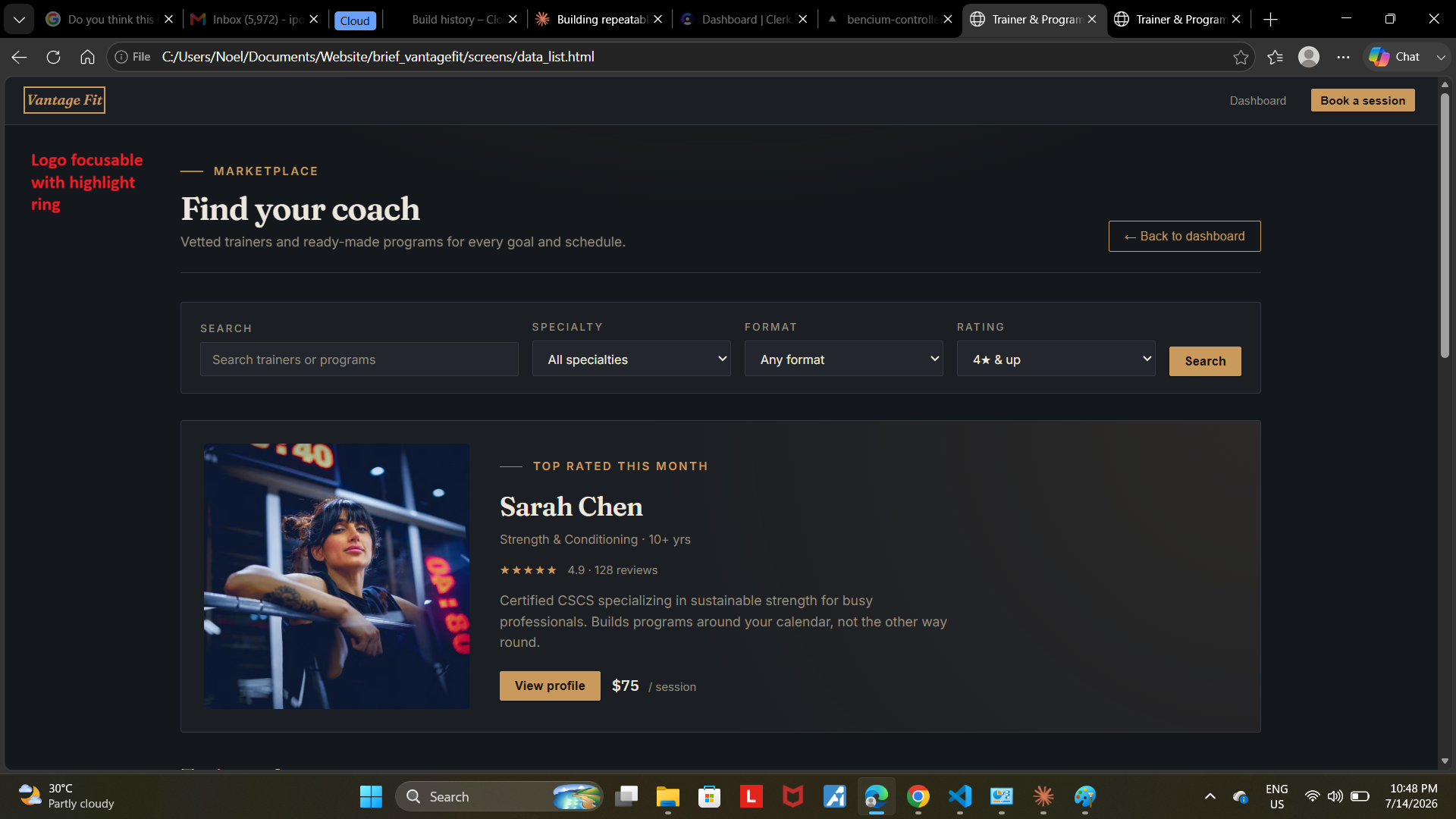
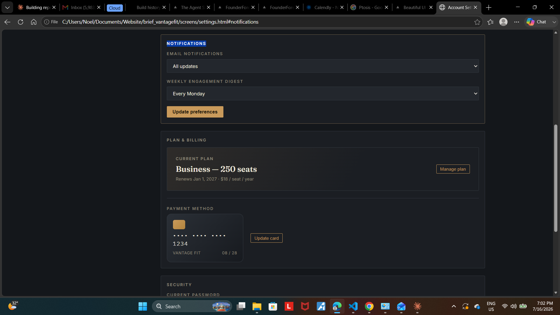
One honest wrinkle from the process: confirming the focus ring visually took more digging than expected, because the preview browser I was testing in enforced its own default focus styling above the custom CSS. Tracing that down required inspecting the parsed CSS rules directly rather than trusting what rendered on screen — a reminder that "it looks right" and "it is right" aren't always the same question, especially with accessibility fixes.
The actual takeaway
A visual-design skill and a UX/interaction-design skill are not competing versions of the same tool. They solve genuinely different problems, and neither one covers the other's blind spots. frontend-design will not tell you your settings tabs are dead, because that was never the question it was built to answer. A UX-focused audit won't make your typography distinctive, because that isn't its job either.
If you're using AI to help build interfaces — for a client, or for your own product — the real lesson isn't "which skill is better." It's that visual polish and interaction correctness are two separate checks, and skipping either one leaves a real gap that looks fine right up until someone actually tries to use the thing.